Lambda Warsawa

Warsaw is committed to reactivating the intervention hostel for LGBT+ people who have found themselves in a homelessness crisis. The municipal competition to run a 24-hour shelter for these people has just ended. This means that the intervention hostel will soon be reactivated as training flats, which will be managed by Lambda Warszawa. This facility […]

Voice of Heart fondation / Głos Serca

Krakow has become the first city in Poland to finance an LGBT support shelter. The shelter has been run by a charitable foundation, «Glos Serca» («The Voice of the Heart») since 2016, but has been struggling financially. The organisation offers temporary accommodation and psychological counselling for up to 12 homeless LGBT people at the facility.

Subscribe to our newsletter!

Rainbow Welcome! visual universe

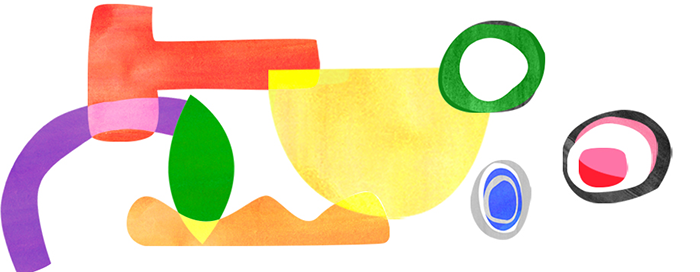
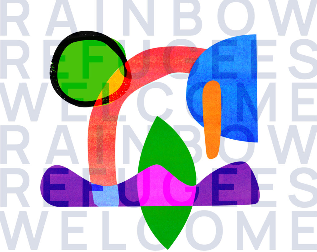
Rainbow Welcome! visual identity has been developed by Alison Roger France, in collaboration with PLS and all the partners. 

She studied the complexity of sexuality, sexual orientations, genders, gender expressions, identities, sexual characteristics, fluidity between the various spectrums, etc. She also adopted a reflective creation process including refugees’ journey in life and on earth to finally come with those organic forms whose nasting, movements and textures aim at illustrating the multiplicity and complexity of each and all individuals. Of course, the colours of the LGBTIQ+ flag have been used. The whole is wanted to be dynamic, intriguing and … positive. Our message is the one of reception and inclusion, as stated in our motto “Rainbow refugees, WELCOME!”. 

Suscríbase a nuestro boletín de noticias.

El universo visual de Rainbow Welcome!

La identidad visual de Rainbow Welcome! ha sido desarrollada por Alison Roger France, en colaboración con PLS y todos los socios.

Estudió la complejidad de la sexualidad, las orientaciones sexuales, los géneros, las expresiones de género, las identidades, las características sexuales, la fluidez entre los distintos espectros, etc. También adoptó un proceso de creación reflexivo que incluía el viaje de los refugiados en la vida y en la tierra para llegar finalmente a esas formas orgánicas cuyos nidos, movimientos y texturas pretenden ilustrar la multiplicidad y la complejidad de todos y cada uno de los individuos. Por supuesto, se han utilizado los colores de la bandera LGBTIQ+. El conjunto quiere ser dinámico, intrigante y… positivo. Nuestro mensaje es el de la acogida y la inclusión, como reza nuestro lema « Rainbow Refugiados, ¡BIENVENIDOS!».